Waveforms
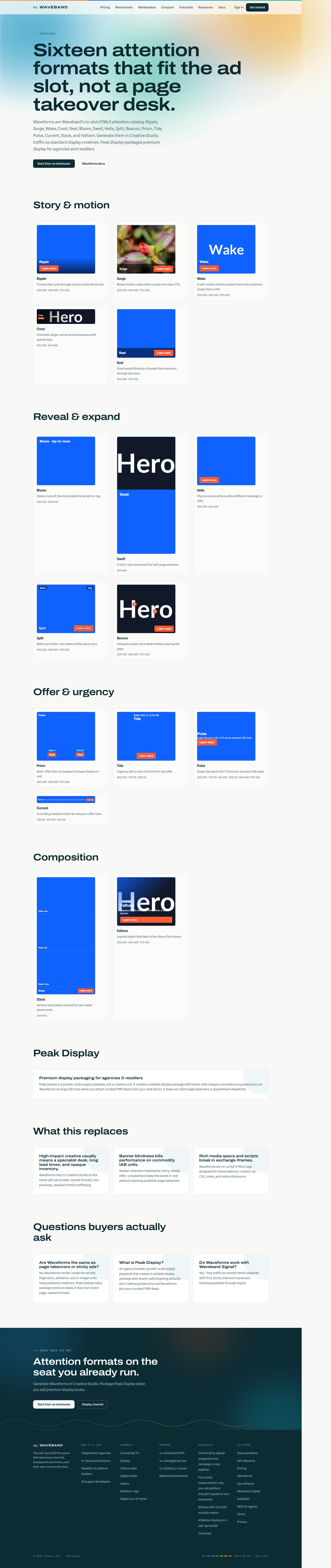
Waveforms are Waveband's in-slot HTML5 attention formats: twenty named treatments you generate in Creative Studio and traffic as ordinary html5 creatives (standard iframe tags). Each unit is real markup with CSS motion and native interaction (carousels, video, flip, expand, wipe, hotspots, ticker): not a static JPG, and not page-takeover JavaScript. Previews below are live iframes from the same renderer that ships to the exchange, using a Waveband sample campaign (product headlines and branded demo art). In Studio you replace that with your brand kit and media.
Marketing gallery: /features/waveforms. Console: /app/studio. There is no separate Waveform API type: Studio writes normal html5 creatives.
In-slot vs page-owned inventory
Waveforms render inside the ad slot. Page skins, adhesion bars, in-image overlays, and true interstitials require publisher SDKs or curated inventory deals: they are not a Studio toggle. For premium display packaging on the growth suite, use Peak Display (below) and attach your own PMP deals from the deal library.
Full catalog
Story & motion
Ripple
Frames that cycle through a story inside the ad slot.
- When to use: Multi-beat stories or product walkthroughs that need more than one still.
- Required assets: slideImageUrls
- Sizes: 300×250, 300×600, 970×250
- Trafficking: Needs 2-3 https slide images. Cycles in-slot; no external scripts.
Surge
Muted motion video with a poster and clear CTA.
- When to use: When you have a short muted video and want motion without leaving display.
- Required assets: videoUrl, posterUrl
- Sizes: 300×250, 300×600, 970×250
- Trafficking: Muted autoplay video + poster; exchange iframe policies still apply.
Wake
A soft-motion brand moment that holds attention longer than a still.
- When to use: Brand moments that should feel alive but stay lighter than full video.
- Required assets: motionImageUrl
- Sizes: 300×250, 300×600, 970×250
- Trafficking: One motion-capable image URL (https).
Crest
Cinematic large-canvas brand presence with sparse type.
- When to use: Premium homepage or brand flights on large canvases (billboard / half-page).
- Required assets: heroImageUrl
- Sizes: 970×250, 300×600
- Trafficking: Hero image on 970×250 or 300×600; keep type sparse.
Reel
A horizontal filmstrip of panels that advances through the story.
- When to use: Horizontal narrative panels: lookbooks, steps, or sequential offers.
- Required assets: slideImageUrls
- Sizes: 300×250, 970×250
- Trafficking: 3-5 https panels; advances horizontally inside the slot.
Flare
Kinetic type: copy beats that write themselves in sequence.
- When to use: Copy-first messages where the words are the creative (launches, manifestos).
- Required assets: tickerLines
- Sizes: 300×250, 300×600, 970×250
- Trafficking: 2-4 short copy beats from Studio; the headline lands as the finale.
Reveal & expand
Bloom
Opens more of the story inside the ad slot on tap.
- When to use: When tap-to-reveal more copy beats a second landing page hop.
- Required assets: expandBody
- Sizes: 300×250, 300×600
- Trafficking: Expand body is plain text (HTML-escaped); expands in-slot only.
Swell
A tall in-slot reveal built for half-page attention.
- When to use: Tall placements where a deeper in-slot story earns the height.
- Required assets: expandBody, heroImageUrl
- Sizes: 300×600
- Trafficking: Expand body + hero; half-page only.
Helix
Flips to a second face with a different message or offer.
- When to use: Two-sided messages (feature ↔ offer, problem ↔ proof).
- Required assets: flipFrontUrl, flipBackUrl
- Sizes: 300×250, 300×600
- Trafficking: Front and back https images.
Split
Before and after: two states of the same story.
- When to use: Before/after, old/new, or contrast storytelling.
- Required assets: beforeImageUrl, afterImageUrl
- Sizes: 300×250, 300×600, 970×250
- Trafficking: Before and after https images.
Beacon
Hotspots reveal more detail without leaving the page.
- When to use: Product detail without leaving the page: hotspots on a hero.
- Required assets: heroImageUrl, hotspots
- Sizes: 300×250, 300×600, 970×250
- Trafficking: Hero image + hotspot labels/positions from Studio.
Sonar
Hover pings reveal the image beneath the surface.
- When to use: Curiosity-driven reveals: let readers uncover the image themselves.
- Required assets: heroImageUrl
- Sizes: 300×250, 300×600, 970×250
- Trafficking: One hero image; the hover grid is generated. Touch uses press-to-reveal.
Offer & urgency
Prism
Multi-offer tiles so shoppers browse choices in-unit.
- When to use: Multi-SKU or multi-offer browsing inside the unit.
- Required assets: offerItems
- Sizes: 300×250, 300×600, 970×250
- Trafficking: Offer tiles (label + optional image) from Studio.
Tide
Urgency with a clear end time for the offer.
- When to use: Time-bound promos with a clear end (sales, registration windows).
- Required assets: endsAt
- Sizes: 300×250, 728×90, 320×50
- Trafficking: Ends-at datetime drives the countdown display.
Pulse
Draws the eye to the CTA across standard IAB sizes.
- When to use: Standard IAB sizes that need a stronger CTA pull without heavy media.
- Required assets: Brand kit + copy only
- Sizes: 300×250, 728×90, 160×600, 320×50, 300×600, 970×250
- Trafficking: Copy + brand kit only; works across the full IAB resize matrix.
Current
A scrolling headline ticker for newsy or offer lines.
- When to use: Newsy headlines, rotating offers, or ticker-style announcements.
- Required assets: tickerLines
- Sizes: 728×90, 970×250, 320×50
- Trafficking: Ticker lines from Studio; best on leaderboard / billboard / mobile.
Shoal
Offer strips that expand as shoppers explore them.
- When to use: A few strong offers that deserve exploration, not a static grid.
- Required assets: offerItems
- Sizes: 300×250, 970×250
- Trafficking: 2-4 offer strips (image + label + CTA); idle motion demos the expand.
Composition
Stack
Vertical story beats stacked for tall mobile placements.
- When to use: Mobile half-pages that read as stacked story beats.
- Required assets: stackFrames
- Sizes: 300×600
- Trafficking: Stacked frames (copy + optional image) for 300×600.
Fathom
Layered depth that feels richer than a flat banner.
- When to use: Layered depth for brand presence that still fits the slot.
- Required assets: heroImageUrl
- Sizes: 300×250, 300×600, 970×250
- Trafficking: Hero image with layered CSS depth: still one html5 creative.
Drift
A swipeable panel deck that puts the story on the reader's thumb.
- When to use: Mobile-heavy flights where swiping feels native to the reader.
- Required assets: slideImageUrls
- Sizes: 300×250, 300×600
- Trafficking: 2-5 https panels; native scroll-snap swipe, no scripts.
Skins
Studio skins are Bold (brand-color field) and Clean (light field). Both escape copy into attributes/text nodes: no raw HTML from the brief.
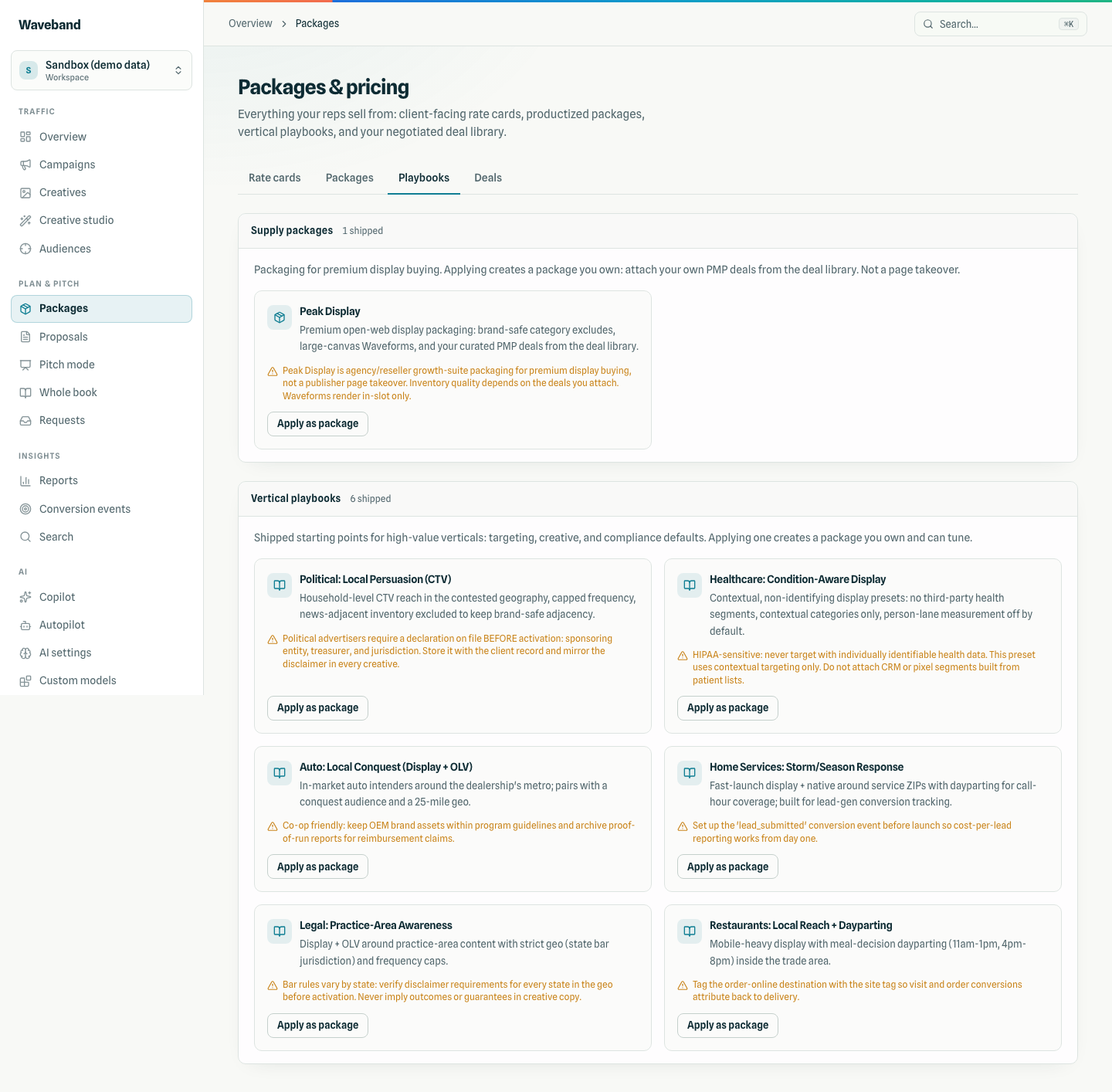
Peak Display
Peak Display is an agency/reseller supply playbook (not a creative type). Applying it creates a sellable display package with brand-safe category excludes (IAB25 / IAB26), a $1,500 budget floor, and creative guidance to prefer large-canvas Waveforms plus deals you attach from your library. It does not ship deal IDs and does not claim page takeovers or guaranteed viewability.
Console: Packages → Playbooks (agency/reseller seats). Tour: Console guide.
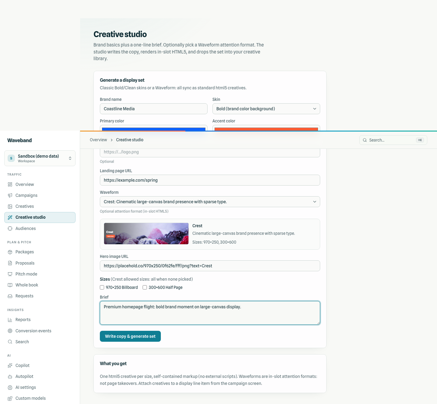
Studio how-to
- Open Creative Studio (requires
creatives:write). - Choose a Waveform from the grouped picker: the live thumbnail updates immediately.
- Fill brand kit, brief/copy, and any required media fields (https URLs only).
- Pick allowed sizes for that format and generate: each size becomes an html5 creative.
- Attach creatives to a display line item from the campaign screen as usual.
Limits
- No JavaScript in tags: motion via CSS, video, and native elements only.
- https media only: no
javascript:or data URLs for slides / video. - Delivery is inside exchange iframes; host-page DOM access is not available.
- Click macros use
{{CLICK_URL}}; dimensions sync via a size stub asset (see trafficking notes indocs/trafficking.md).
IAB / LEAN compliance
Tags target the IAB New Ad Portfolio display sizes used in the catalog, LEAN principles (lightweight, AdChoices-friendly, non-invasive), and Coalition for Better Ads rules for muted autoplay video. Shells are exact WxH with overflow:hidden, no border,prefers-reduced-motion, and a clear top-right zone for DAA AdChoices. Automated audit: auditAllWaveforms in packages/core/.../waveforms/compliance.ts.
Live size matrix (every format × every allowed size): /docs/waveforms/lab.
Related
- Waveforms lab: every size, interactive embeds
- Waveforms feature page: live gallery of all 20
- Display channel
- Console guide: Studio and growth tools tour
- Tracking & pixels / Waveband Signal
- API reference: creatives endpoints (Waveforms are ordinary
html5creatives; no separate type) - Attention display on a self-serve DSP (resources article)